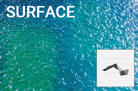
Resembles a topographic map with colors and patterns representing similar values.
Useful for spotting optimum combinations between 2 sets of data.
3D, Wireframe 3D, Contour and Wireframe Contour versions exist.
Plots data as horizontal bars representing stages in a process.
Values typically decrease from top to bottom so chart resembles a funnel.
Could be built using a stacked bar chart.
Waterfall, Funnel or Surface charts
Latest Additions
TEXTJOIN() function
26 March 2022
REPLACE() function
26 March 2022
TEXT() function
26 March 2022
RANK.AVG() function
25 March 2022
CONCAT() function
22 March 2022
CHAR() function
21 March 2022
Register (for free!) or Login to access bonus materials
About xlsnippets
Learn how to master functions, charts, pivot tables and more using Excel for Microsoft Office 365. Simple instructions and embedded spreadsheets help you practise the basics.
Latest Updates
TEXTJOIN() function
26 March 2022
REPLACE() function
26 March 2022
TEXT() function
26 March 2022
RANK.AVG() function
25 March 2022
CONCAT() function
22 March 2022
Coming soon
xlsnippets.com is currently in beta version. More functions and bonus content for registered users will be added weekly. Detailed training courses with additional downloadable resources are also on the horizon!


