

Plots data as a series of color-coded, positive and negative floating columns.
Also known as a bridge chart, shows the impact of additions and subtractions to an initial value.
Useful for visually displaying running totals.
Data Format
- x-axis: Categories (e.g. years)
- Categories are distributed evenly along the horizontal axis.
- The first and last categories can be set as initial and end values with the interim series showing stepped changes.
- y-axis: Data Series (e.g. mobile cellular subscriptions per 100 people)
- Series are shown as floating columns, color-coded for positive and negative values.
- Double-click a column and 'Set as total' to change a floating column to one fixed to the horizontal axis
| Series | |
|---|---|
| Category 1 | # |
| Category 2 | # |
| Category 3 | # |
| Category 4 | # |
| Category 5 | # |
Try it now!
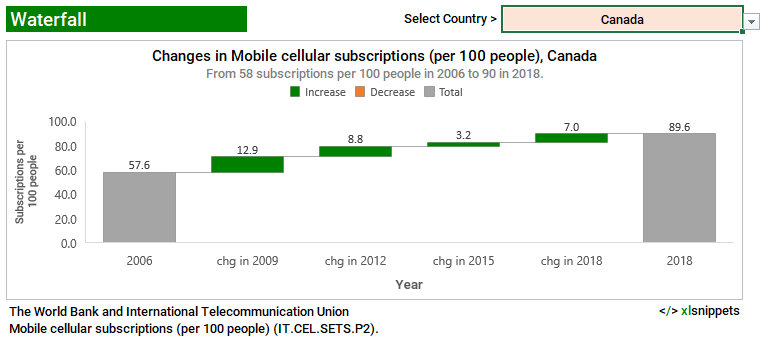
- Select a country using the dropdown list to view the changes in cellular subscriptions per 100 people over time.
- Note how the chart and title adjust to reflect the different values.
- The first and last columns show the values for their respective years; the interim columns show the changes over time.
- In the event the embedded chart does not display, a static image is provided below.
- This chart was built using data validation lists, named ranges, conditional statements and the INDEX and MATCH functions.
Related Waterfall, Funnel, Stock, Surface or Radar Charts
- Funnel
- Radar
- Stock (High, Low, Close)
- Stock (Open, High, Low, Close)
- Stock (Volume, High, Low, Close)
- Stock (Volume, Open, High, Low, Close)
- Surface