

Plots data into quartiles, highlighting the mean, median and outliers.
Indicates whether a distribution is skewed or whether there are outliers in the data set.
Use with multiple data sets which relate to each other in some way.
Data Format
- x-axis: Categories (e.g. regions)
- Categories are distributed evenly along the horizontal axis.
- Becomes visually complex as more categories are added.
- y-axis: Data Series (e.g. labor force participation)
- Series are shown as boxes with extended lines ('whiskers') for each category.
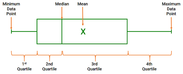
- the ends of the box are the upper and lower quartiles. The box spans the interquartile (2nd and 3rd) range
- the median is marked by a vertical line inside the box.
- the mean is marked by the 'X' and the means of all categories can be joined by a line.
- the whiskers are the two lines outside the box that extend to the highest and lowest observations and indicate variability.
- the circles across the char are the inner points.
- Series are shown as boxes with extended lines ('whiskers') for each category.
|
 |
Try it now!
- Select a gender using the dropdown list to view the differences in labor participation rates.
- Note how the chart and title adjust to reflect the different values.
- This chart was built using data validation lists, named ranges, conditional statements and the IF, MATCH and OFFSET functions.
Related Statistics Charts