

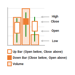
Plots fluctuations in stock prices or other data.
Uses 5 series of values, in order: volume, open, high, low, close.
Data needs to be organized in the correct order.
Data Format
- x-axis: Categories (e.g. countries)
- Categories are spaced evenly along the horizontal axis.
- y-axis: Data Series (e.g. CO2 emissions)
- Series are plotted against the vertical axis (both primary and secondary where necessary).
- Range of values shown as a line, indicating high and low values over time period.
- Open and Close values shown as a bar. An up bar (Close > Open) is often transparent. A down bar (Close < Open) is often filled.
- Volume shown as a vertical column.
|
 |
Try it now!
- Select a region using the dropdown list to view CO2 emissions per capita and exposure rates.
- Volume data is % of population exposed to PM2.5 air pollution levels exceeding WHO guideline value, 2018.
- Open, High, Low and Close data is CO2 emissions (metric tons per capita) from 2005 to 2014.
- Open value is data for the first year that data is available from 2005.
- Close value is data for the most recent year that data is available up to 2018.
- This chart was built using data validation lists, named ranges, conditional statements and the IF, MATCH, OFFSET, RANDARRAY, SEQUENCE, SORTBY and VLOOKUP functions.
Related Waterfall, Funnel, Stock, Surface or Radar Charts
- Funnel
- Radar
- Stock (High, Low, Close)
- Stock (Open, High, Low, Close)
- Stock (Volume, High, Low, Close)
- Surface
- Waterfall