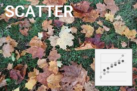

Plots data points for independent and dependant variables.
Often used for scientific, statistical, and engineering data.
Also known as XY chart. Shows patterns in large sets of data.
Data Format
- Categories: (e.g. years)
- Categories are not normally shown on either axis.
- Limit use of scatter plots to when some correlation between data sets is expected.
- x-axis: Data Series 1 (e.g. urban population)
- Independent variables are normally shown on the X axis. Logarithmic scales can be used.
- y-axis: Data Series 2 (e.g. GDP per capita)
- Dependent variables are normally shown on the Y axis.
- Use the Switch Row/Column option on the Chart Design menu to switch data sets between axes if required.
- Formatting:
- There are often too many data points to label everything.
- Use the Value From Cells option under Label Options to apply Category instead of X, Y labels to plots.
- MIN,MEDIAN and MAX functions can be used to identify and label outliers and medians.
- Data points can be joined by curved or straight lines.
- Correlation: a relationship between scatter plots.
- Positive correlation: a pattern extending from bottom left to top right of the chart.
- Negative correlation: a pattern extending from top left to bottom right of the chart.
| Series 1 | Series 2 | |
|---|---|---|
| Category 1 | # | # |
| Category 2 | # | # |
Try it now!
- Select a country from the dropdown list to compare urban population and GDP per capita data.
- The chart, title and values adjust to reflect the data for each year.
- The labels show the years. Data for some years may be missing.
- Select a region from the dropdown list to compare growth rates in GDP per capita and urban population by country.
- The chart, title and values adjust to reflect the data for each year.
- The named countries represent the minimum, median and maximum points on each axis.
- These charts were built using data validation lists, named ranges, conditional statements and the AND, COUNTIF, ISEVEN, IF, IFERROR, MATCH, MAX, MEDIAN, MIN, OFFSET, ROUND and VLOOKUP functions.
Related Scatter and BubbleCharts